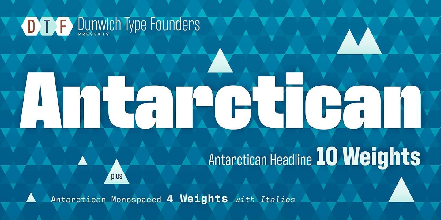
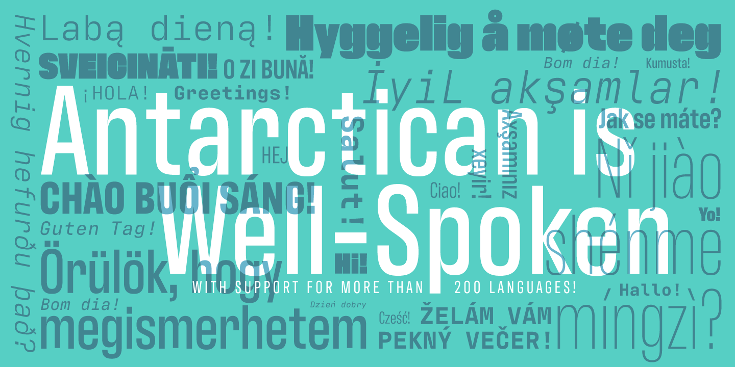
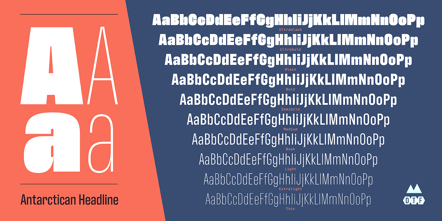
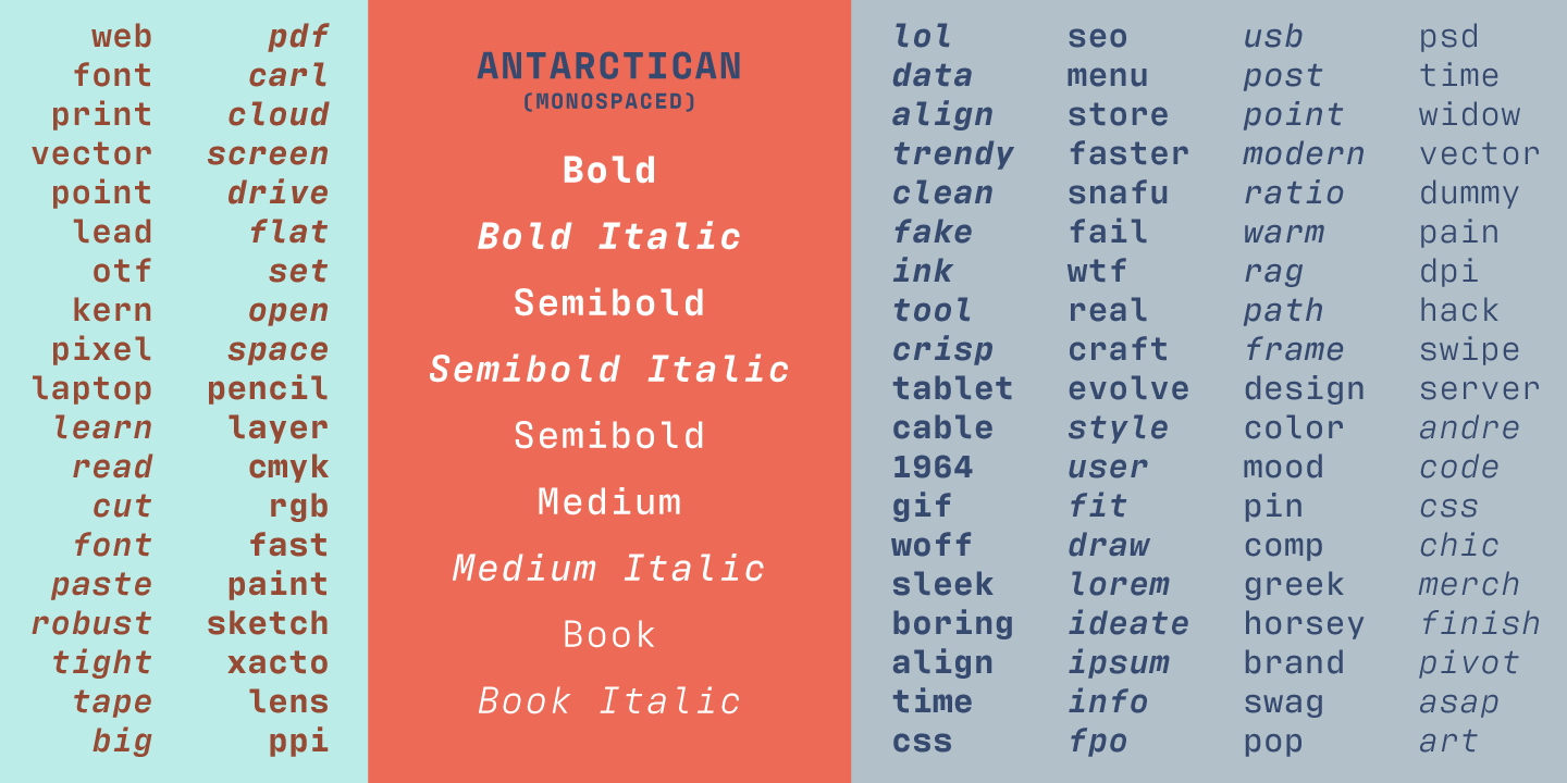
Antarctican mono was designed for text on Retina displays and in print. It is an unembellished work horse that both invokes and challenges convention. Asymmetric contrast is paired with deep notches to aid legibility. Orthogonal stroke terminals lead the eye down and across. Monospaced glyphs reject the orthodoxy of evenness. A large x-height boosts the volume of the lowercase, aiding readability at small sizes, and demanding attention in display settings. Antarctican Headline is a matching family of condensed fonts. The headline fonts are proportionally spaced to allow for heavier weights than can be drawn in monospaced typefaces.
Dunwich Type Founders
