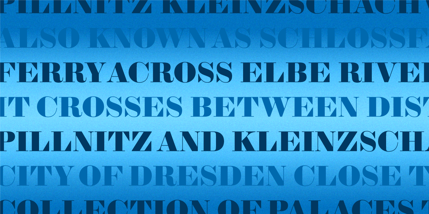
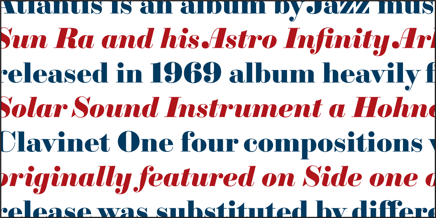
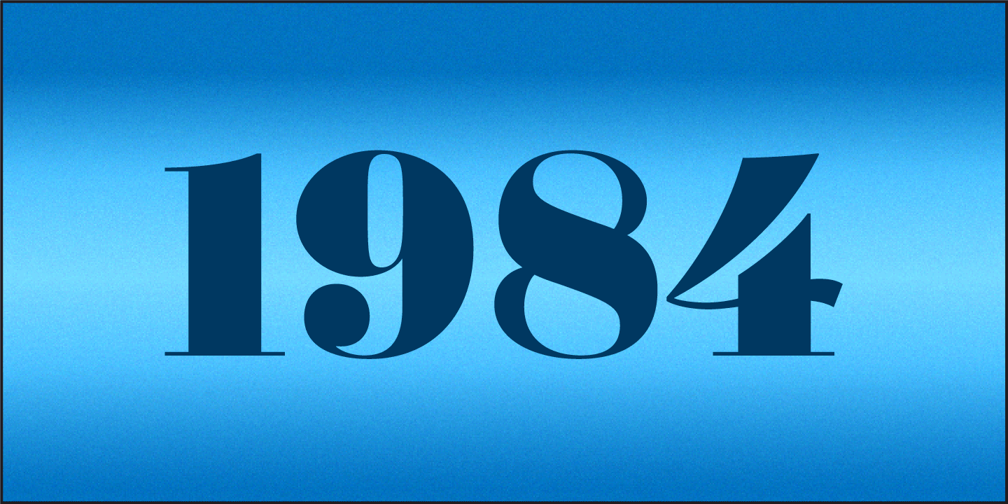
Striking contrast and exquisite curves make Sybarite a powerful tool for attracting attention. The key to a fat face is dramatic contrast between thick and thin strokes that turns letters into arresting silhouettes. Most fat face fonts were drawn to be used at one size, causing thin strokes to disappear at small sizes and thicken at large sizes. But Sybarite’s four optical weights provide striking contrast at any size.
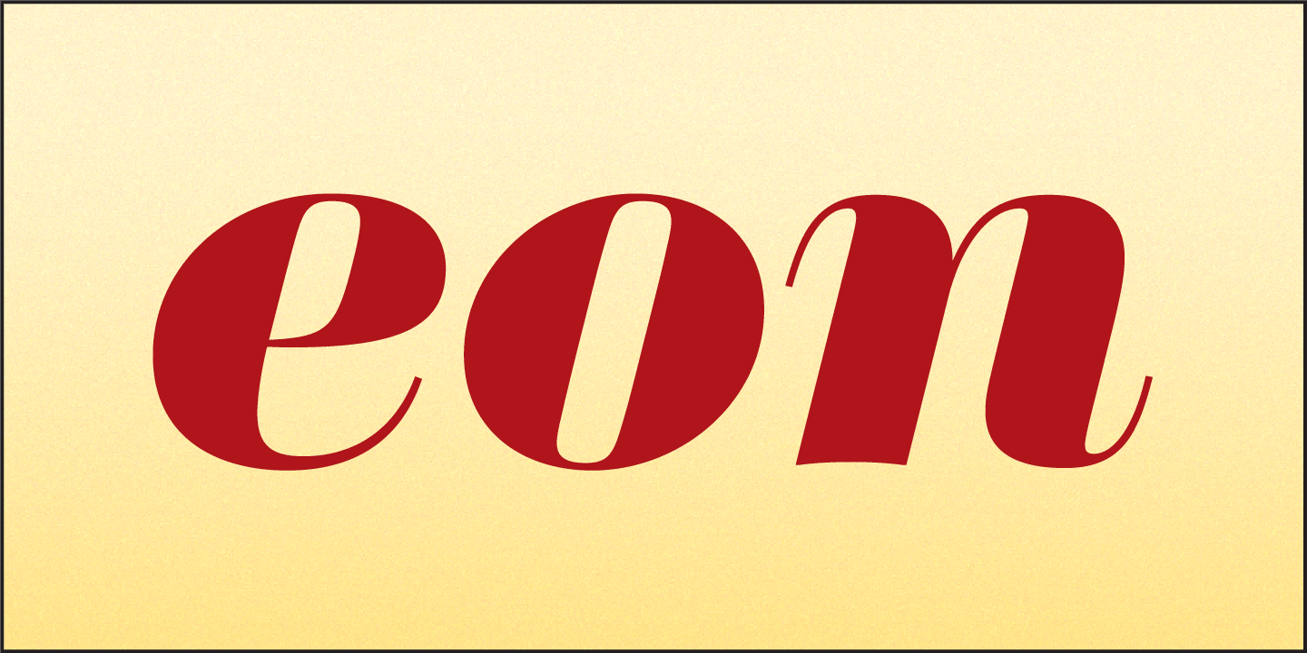
Adept draughtsmanship makes Sybarite as exquisite as it is striking. Every ample stroke, graceful curve, and pointed serif received careful attention. Alternate versions of a, F, R, and T prevent gaps caused by white space in traditional fat faces. Italic fonts have a steep slant, sweeping pothook serifs, and seven alternate swash capitals. Contrast and craft make Sybarite stand out in headlines, covers, posters and packages.


